
If you’re new to canvas apps, one of the first things you may have noticed is the dire lack of selection when browsing the available themes.
Here you are after an App In A Day with your newly minted app. Your buttons are wired up and your customized formulas are executing just as you wanted. You stare at the standard blue color-coordinated components of your screens and think to yourself, there’s got to be a way to punch this up a little!
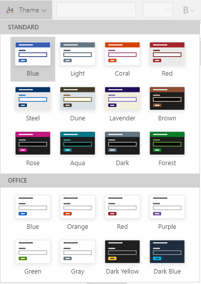
Your mouse finds its way up to the Theme menu and this. This. THIS. is all you find.
Most of the combinations make your eyes hurt, so you resign yourself to a standard white-and-neutral-color palette and decide you can just recolor the components manually.
How hard can it be? you ask yourself.
How hard indeed. 😫
So, for the 99% of apps you’ll build where the color theme needs to match your company’s branding guidelines, you have got to find a better way than manually changing the RGBA() value of every Fill, Color, HoverFill, etc. property of every single component in your app.
Note: all of the methods listed here work best if implemented before you start building your app.
good: style guide screen
For simple apps, a good method of quick styling is with a Style Guide Screen. This is a “hidden” screen within your app— meaning you will never hook it up to your live screens with a Navigate()— that holds a template for every control you use throughout your app.
One of the key benefits of this method is that it is visual and interactive, allowing you to see and manage the color theme all in one place. If you need to make adjustments to the colors later, you only need to make the updates to your color palette rectangles on the Style Guide Screen.
This makes it an appealing choice for citizen developers and those first starting out on their Power Apps journey.
how to implement
- Insert a New Screen into your existing canvas app.
- Add rectangle icons and set their Fill properties for all the colors in your palette.
- Add the components you’ll use in the app. Examples:
- Primary & Secondary Buttons
- Text, Dropdown & Combobox Inputs
- Form
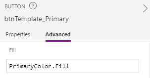
- Update each of the color properties of the components, referencing the palette rectangles (
PrimaryColor.Fill) instead of manually setting the color value.- Make sure your color scheme addresses states like Hover/Pressed/Disabled
- 💡 Double-check that you’ve set the properties for the text color, fill color, border color and special properties like dropdown chevrons for all states!
- Start building your app. When you need a component, copy it from the style guide screen.
Note: For components that will be reused multiple times throughout an app (like a header or menu), you should use custom components instead.

downsides
As you’re weighing your options for theming your future canvas app endeavors, there are a few considerations with this approach.
1. Performance
The App In A Day module for canvas app trains you to link your components together by directly referencing them. If you have a gallery on Screen1, for example, you might set a label on your detail screen to Screen1_Gallery.Selected.Name.
However, such cross-screen linking results in a performance drag for your app. Power Apps must load the screen the user has navigated to, along with all screens linked via component references, each time the user navigates between screens! If you have any code that is run when the cross-linked screens are loaded, it’s a fair bet that code will execute uselessly in the background, whether you want it to or not.
❗ For this and several other reasons, I recommend to avoid direct component references in your apps.
2. Future Updates
When it comes to updating the colors after-the-fact, you do need to open the canvas app to make the edits. That will limit who in your organization can change the colors (usually just the app maker and any co-owners).
Additionally, you’re out of luck if you decide you want to easily add colors into your theme later. You’ll have to make all those edits manually to each and every component already added into the app.
conclusion
The biggest drawback of the Style Guide Screen approach to app color theming is the cross-screen linking issue. Which completely rules out style guide screens as the recommended color theme method!
It’s not a bad approach for your first app as you’re learning the canvas app ropes. As you progress in your skills (and especially if you’re building any apps for production use by others), you’ll need to leave this one behind.
Continue to style & theme options in canvas (part 2)

 Joy of Power Apps
Leave a comment