

It’s high time to write about one of my favorite subjects in canvas apps: animation!
For users who interact with visual interfaces, animation and moving images surround us in our digital lives. From humble beginnings of very pixelated animated GIFs cluttering the front pages of Web 1.0 sites, today animation has become an integral part of the modern digital visual experience. I am accustomed to seeing them on every computer program and mobile app, on websites and in slideshow presentations, lighting up loading screens and pop-up menus. At this point, sometimes I find it more jarring to experience no animation at all. So when it comes to building my own visual user interface in canvas apps, I find that bringing in animation is a fun way to bring life to my hand-crafted UI.
It’s important to note a few things as we step deeper into this topic:
- Animation should be a seasoning, not the main dish.
Have you ever sat through a presentation where the slide author either overused or misused animations? It can be tedious to watch the content bounce all over the screen for several agonizing seconds.
Animated elements should not detract or distract from your app’s main functionality. The best animated effects will be so subtle and intuitive that your end user hardly notices them.

- Not every end user can perceive your user interface.
While this post is not dedicated to accessibility topics in Power Apps, I would be remiss if I didn’t mention it when talking about implementing features which are 100% visually accessible only. If your animated effect is required to get full use of your app, if it interferes with navigation, if it conveys meaning— then you have created an app which is not accessible! Your end users with low vision and those leveraging assistive devices may not be able to use or understand it.
If you are not someone with low vision yourself, I invite you to educate yourself on basic web accessibility topics as you continue on your Power Apps journey. W3C has a good introductory overview and many more resources available. Try using your app without using a mouse or touchscreen. Turn on Narrator (or the screen reader native to your mobile device) and then use your app without looking at it.
Treat your animated effects as “set dressing” only, and do your part to ensure all end users be able to operate your app fully.
Let’s now talk through three methods of bringing in animations and animated effects: out-of-the-box, simple and complex.
out of the box animations
Two very easy ways of bringing animated elements into your canvas apps are available directly in the Power Apps Studio for navigation and Gallery interactions.
Navigation
Within the Navigate() expression, there is an optional parameter for ScreenTransition. Screen transitions are analogous to the PowerPoint slide transitions feature. The default is None, so if you don’t specify, it will simply flick from one screen to the other without any animated effect.
There are three main transition options available today:
- Fade — gently dissolve the current screen into the new screen
- Cover — the new screen wipes across the current screen from right-to-left (to “cover” it up)
- UnCover — the current screen wipes away to reveal the new screen from right-to-left (to “uncover” it)
Additionally, Cover and UnCover have alternate versions (CoverRight and UnCoverRight respectively) which reverses the direction of the wipe to left-to-right.
My favorite of these is to combine Cover and UnCoverRight in a two-screen navigation. First, the new screen flies out from the right, and then when returning to the original screen it slides back in to the right-hand side. It gives the impression of a modal fly-out window with none of the additional show/hide effort. The same effect from the left-hand side can be created with UnCover and CoverRight.
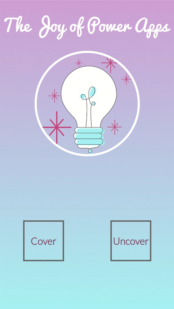
I recommend to stick to one or two of the ScreenTransition options, and then make sure they are consistent throughout your app navigation.
Gallery Interactions
One little unsung hero of Gallery properties is likewise called Transition. The Transition property is similar in concept to a Hover property, but is unique to Gallery Items. The Transition describes an animated effect when hovering across multiple Items in the Gallery. The default is also None, so if you don’t specify, there will be no animated effect when hovering.
The two Gallery Transition options are:
- Pop — slightly enlarge the Item so it appears to “pop” out of the Gallery
- Push — slightly shrink the Item so it appears “pushed” into the Gallery
The Gallery Transition is a subtle effect to help visually indicate which Item a user would select if they clicked. Pop is my favorite as I think it looks more modern.
Note: just like Hover effects, Gallery Transitions do not work when users are accessing the app via tablets or phones, since there is no mouse than can hover. If your primary use case is on mobile devices, you can skip this feature.
simple animations
Not everything in canvas apps needs to be complex PowerFx code. Sometimes simple solutions are the best ones! So, the next time you’re looking to bring a bit more life to an app, consider adding animated GIFs.
I’m not just advising this because choosing the GIFs to accompany my blog posts is one of my favorite parts about authoring them. 😅 Animated GIFs can add considerable complexity without a lot of time or effort. Even better, by uploading your animations as images, you have access to all the accessibility features of Images to describe the effect to screen readers.
There are a few ways you could use animated GIFs in canvas apps.
Animated Icons
Add a little extra flavor to your app by uploading an animated icon GIF!
I often prefer to upload images to create my own icons in my apps instead of using the icon library provided in the App Studio. I make use of icon sites which are freely available online with freeware or shareware attribution licenses. My preferred site is Icons8: thousands of static icons available across 35 different styles, with the ability to change icon colors and add overlays. This allows me to create a fully customized UI that doesn’t look like your standard 3-screen Power App, as well as getting access to non-standard icon sets for some of my more unusual canvas apps. When I create apps for my teams and communities at my current company, this gives me the added bonus of having a visual style that is easily attributed to me!
Icons8 has 5 different styles of animated icons available, many of which are under their free link-back attribution license. The animated icons can be added as permanent fixtures to your app, or can bring features to life during user interaction. In the below example, I leverage the OnSelect property of the Text Input control and a Context Variable to flip an Image control between a static icon and its animated counterpart. When the user changes focus to a different control, I can swap them back.
Loading Screens
Sometimes lengthy load times are unavoidable in canvas apps. If you’re waiting for the results of a Power Automate flow, churning a lot of data through business logic, or maybe just have a data source which is slow to respond, that can result in some agonizing seconds looking at the little loading dots at the top of the screen. Asynchronous processing can be difficult with an end user waiting on the other side, especially if the output is required to populate your app with data or proceed to a next step in the process.
In these situations, I purposefully bring in animation to create a more user-friendly loading screen. This protects the user from accidentally interfering with the operation, such as navigating away or closing the app while the process is still in progress. It also embodies the topic of Perceived Performance: communicating intentionally with your user that the current experience is intentional and building up their trust that your app will communicate again when it is ready to respond.
Your PowerFx code can be written so that when the operation has concluded, you can automatically dismiss the animation to allow the user to proceed. In multi-screen navigation, use Navigate() to proceed to the next screen. When using modal pop-ups, Context Variables can be used with the GIF’s Visible property.


Other Uses
There is no special trick to using animated GIFs in a canvas app: they are treated like every other image file. So long as the file size doesn’t exceed the limits for media files (64MB) or app size (200MB), you could get creative here. Accessing the GIFs from online data storage also opens up additional possibilities!
Some potential uses could include:
- Logo
- App background
- Custom branded loading screen
- Animated videos / illustrations
complex animations
Both the above methods fall short when you want to animate the Controls of your app directly. Swapping in an animated GIF will often not work out when you otherwise need the Control to be dynamically interactive or display information from a data source. There’s also the Image size and app size limits to consider versus the total size of your app and other uploaded media.
The complex method allows you to create custom animated effects on the various Controls of your app to incrementally adjust Control properties. In this section, I will be discussing some of the possible animation effects: movement across the screen, size changes, fade in / out and color changes.
Basic Method
Complex animations are achieved using the Timer control. If you’ve not used Timers before, here are the relevant properties to consider:
- AutoStart — Boolean property. When set to
true, Timer will start when the screen is loaded. - Duration — Duration of the timer (countdown) in milliseconds. Minimum value is 50. Default value is 60000 (1 minute).
- OnTimerEnd — PowerFx code which executes at the end of the Timer duration.
- Repeat — Boolean property. When set to
true, Timer will continually repeat while the screen is active. - Visible — Boolean property. When set to
false, Timer will be hidden on the screen.
The basic idea here is to use the Timer to create a flipbook. First, kick off a Timer when you want to trigger your animation. Next, when the Timer ends, execute code that creates an incremental effect on desired Control(s). Last, run the Timer multiple times repeatedly at the minimum possible duration (50ms). Together, these will give your end user the impression of an animated effect!
💡 Tips:
- Use local Context Variables to manage the properties you want to affect with the animation.
- All variables will need a set starting position, which you can add to your Screen OnVisible property.
- If you want an effect to trigger as a result of a user interaction, you can use Variables to define the AutoStart property or use the
Select()expression on the Timer Control. - If you want the effect to run continuously, the Repeat property can be set to true with no other code.
- Alternatively, if you want the effect to run for a set duration, or until the desired effect has been achieved, then you need some
If()code to check whether the stop condition has been reached yet.
- Alternatively, if you want the effect to run for a set duration, or until the desired effect has been achieved, then you need some
- Use a Button with PowerFx code to return your animation to the starting position. This will give you a way to reset the animation while developing, testing and troubleshooting.
- When finished, hide the Button but leave it in the app so you don’t have to recreate it each time you work on that screen.
Determining Animation Speed
There are three components of the animation’s speed and potency: start position & end position delta, OnTimerEnd interval, and number of loops.
Most animations should last about .25 to .5 seconds. This is slow enough that the end user will see it, but fast enough that it shouldn’t get in their way during app use. Given that the minimum duration of the Timer is 50ms, we can divide the total animation duration by the Timer duration to determine the # of loops we have to work with. For the recommended animation durations, we have between 5 and 10 loops.
With the number of loops, we can determine the interval: find the delta between your starting and ending values, and then divide by the number of loops. If your starting value is greater, then you’ll need to decrease by that interval in the code. If your ending value is greater, then you’ll need to increase in the code. With this approach, you can also increment a loop variable in the OnTimerEnd code, simplifying the Repeat code to something like If(varLoopCount < 9, true, false).
For more drastic animations, you will likely need a longer animation using a smaller interval and more loops. Moving an object 100px in 250ms is only 5 loops with a 20px interval. That’s a lot more achievable than moving it 1000px with a 200px interval. You will likely need some trial and error to find the right balance of interval size and animation duration for the effect.
Move Objects
Objects on your canvas screen are defined by their X/Y properties. These properties can either be hardcoded values representing pixels, or defined by formulas for more precise or dynamic placements.
To create a movement animation, therefore, you will set the X and/or Y property to a Variable like “varObjectX”. Your OnTimerEnd code should increase or decrease the Variable to produce the desired effect.
For example, you can create a fly-out modal menu effect by changing the X property. Let’s assume the fly-out width will be 100px and the animation should be very fast (250ms).
- In Screen.OnVisible, set
varX = App.WidthandvarLoop = 0 - On the menu Control(s), set
X = varX - On the button or icon to open the menu, trigger the animation Timer
- In Timer.OnTimerEnd, set
varX = varX - 20andvarLoop = varLoop + 1 - In Timer.Repeat, set
If(varLoop < 4, true, false)
You absolutely do need a stop condition with a movement effect! Otherwise, your object is likely to marquee its way across the screen and fall right off the other edge.
Change Object Size
Building off of what we just covered, the size of an object on the screen is likewise defined by the Height & Width properties of a Control. Just like with the X/Y coordinates, the value of H/W can be adjusted to cause an object to grow or shrink.
While moving an object is fairly straightforward, changing its size is a bit tougher. ⚠️ There are a few areas to watch out for:
- Both the Height and Width properties may need to be changed at the same time and interval to avoid warping an object.
- This may be avoided by having one property defined by the other. For a square object, for example, Width could be set to
Self.Height. Changing the Height property with the animation Timer will therefore automatically adjust the Width.
- This may be avoided by having one property defined by the other. For a square object, for example, Width could be set to
- Changing the Height/Width in one direction may require you to also change the X/Y. If your object is anchored to a particular edge or corner, you’ll need to adjust the X/Y to make sure the animation re-adjusts the object position relative to its new size.
- Increasing the H/W will push the edge of object to the right and down.
- Decreasing the H/W will bring the edge of object in to the left and up.
This method also requires a stop condition! Otherwise, your object will shrink down to nothing or grow bigger than the entire screen.
Object Fading
The Visible property of Controls is merely an on/off switch. Sometimes you may wish for a softer effect which gradually fades an object in or out of the screen.
⚠️ Note: this method requires the use of RGBA() values. Using Hex color codes will not work.
There are 4 channels to an RGBA color code: the red, green and blue color values from 0 to 255, and the alpha channel from 0 to 100 (or in this case, expressed as decimal values from 0 to 1). The alpha channel controls the color’s transparency/opacity, from fully transparent at 0 and full opaque at 1.
The Timer animation method can increment or decrement the decimal value to create a fade effect. With 10 loops in a half-second animation, you can take an object all the way from fully opaque to fully transparent or vice versa in a 0.1 interval. However, since we’re working with decimal values, you can create a smoother effect by changing the value in smaller intervals like 0.05.
The alpha channel variable needs to be added to a color property of the target Control(s), like: RGBA(100,100,100,varAlphaValue). If your object has multiple color properties like borders, hover effects, etc., make sure you account for them. For a Fade out, you may also need to set the Visible property to false once the color is fully transparent to avoid any issues with the object overlaying other controls.
Object Color Change
One of my favorite effects for animation is a color change. This can be done very subtly, or it can be an obvious and impactful transformation!
⚠️ The trick with a color change is that you need six to eight different variables to individually control the Red, Green, Blue and (optionally) Alpha channels of both colors. You will likewise need to calculate the individual interval for each channel since their starting and ending values can be very different.
Here’s a little code snippet and the resulting effect:
//OnTimerEnd
UpdateContext(
    {
        varTopRed: varTopRed - 4,
        varTopGreen: varTopGreen + 8.5,
        varTopBlue: varTopBlue + 3.2,
        varBottomRed: varBottomRed + 4,
        varBottomGreen: varBottomGreen - 8.5,
        varBottomBlue: varBottomBlue - 3.2,
        varColorCount: varColorCount + 1
    }
);

//Repeat
If(
    varColorCount < 9,
    true,
    false
)

//Gradient Code
background: linear-gradient(180deg,rgba(" & varTopRed & "," & varTopGreen & "," & varTopBlue & ",1) 0%, rgba(" & varBottomRed & "," & varBottomGreen & "," & varBottomBlue & ",1) 100%)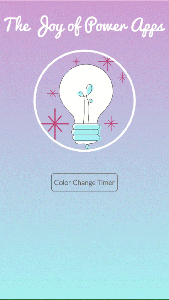
conclusions
I covered a lot of ground today on options for animations in canvas apps: what’s available to you right now in the Power Apps Studio, what you can easily import in with for animations which already exist, and what you can create yourself with enough time and PowerFx code.
As you go forward into this fun world, I’ll leave you with a few considerations:
- I would describe the complex/custom animation approach as an “off-label” use of Timers. Like any feature which isn’t exactly intended for said use case, Your Mileage May Vary as Microsoft proceeds down its roadmap!
- The minimum duration for the Timer is 50 ms: that means your animations will render at around 20 frames per second. This is on par with the frame rate of early silent films 🙃. This flipbook level of quality is not going to hold up to the 60 fps animations and renderings common in video today, so take care that you don’t end up creating a worse user experience.
- Creating the custom code animations takes a fair bit of effort in setting up all the requisite variables correctly. It may take a lot of trial & error to understand the concepts, determine the appropriate start/end values, interval size and # of loops. You don’t want your icons to shrink into oblivion or your menu to fly off the side of the screen, so you’ll need enough time set aside for this work. You’ll want to ensure that “the juice is worth the squeeze” before spending a lot of time on it.
- Over-animating an app could seriously annoy your end users. Avoid creating lengthy or “unskippable” animations, especially for frequently used and transactional operations.
- Don’t sacrifice performance for fancy animations! The right user experience is a balanced combination of form & function.
- Movement and size animations are going to be complicated or made outright unfeasible by the use of responsive containers in your app design.
- By design, the Containers override the X/Y and H/W properties dynamically based on app layout and screen size. The “flipbook” animation method requires a static input for those properties that you control with variables.
- If responsive design is an app requirement alongside movement animations, I would stick to OOB effects and animated GIFs.
Happy app building! I would love to hear what animations you have or will implement in your canvas apps in the comments below.

 Joy of Power Apps
This is SO so good Joy!! What a trove of goodness on animation here—this should be required reading for anyone building highly-visual Canvas apps, and even folks building general UI have a lot to gain from this post.
I especially loved the deep-dive on how to create custom animations. It’s demystifying to understand the different elements that make up an animation, and you did a fabulous job breaking everything down in a clear and easy-to-grok way.
On loading screens/indicators, I also wanted to note that these little UX are not only delightful, but also for helping your app *feel* faster to users when waiting on an operation to complete. This is because of the concept of Perceived Performance, where an experience feels quicker & more responsive when you show a spinner or loading bar while waiting. Perceived Performance can ultimately help an app feel more trustworthy: if a user can trust the app to communicate its operations, they’re likely that it will finish them. This MDN article is a great overview: https://developer.mozilla.org/en-US/docs/Learn/Performance/perceived_performance
LikeLiked by 1 person
Thanks Peter for naming the concept of Perceived Performance with loading screens! That’s exactly what I was describing in that section.
While operations are in progress, canvas apps do have a “dots crawl” loading at the upper edge of the app. However, I’m a fan of making it more up-front and user-friendly. As you’ve stated, it allows you to communicate with the end user that the wait is intentional, rather than a time-out issue.
I’m going to include this resource in the main post for visibility.
/joy
LikeLike