
Recently, I had cause to follow my own advice when partnering with a colleague on a canvas app we’re building out for a client. He often brings me head-scratcher problems where the reality of Power Apps and the App Studio doesn’t quite meet the requirements or wireframe designs we had planned out. It’s fun to put our heads together to troubleshoot and figure out a solution or workaround. (Quick shoutout— David, you’re awesome!)
In this case, he was implementing a quick shadow effect for a side menu. Although my first response was to point him to my walkthrough in achieve next-level app design with embedded HTML and CSS, he came back a few hours later with questions that my original tutorial did not cover.
The end solution ended up being a bit unintuitive, so an addendum post is in order.
deeper dive into box shadows
To date, I had only played with shadows with a right-down offset pattern. This is pretty typical for components in web pages and apps designed for folks who read left-to-right, and so a left-down or -up offset pattern wasn’t something I had explored yet.
For this use case, we have a side menu sliding out from the right. This will cause the menu to sit on top of the current screen, and is a perfect opportunity for implementing a shadow to visually differentiate the “layers” of the screen. We went to an online CSS box shadow generator to reference (like this one Mozilla has) where David configured the settings he wanted for the shadow, but when he input the code into the HTML Text component, nothing happened.
To uncover the issue and the ultimate solution, it’s important to understand the multiple component properties in play when we’re leveraging the HTML Text component to embed CSS. Let’s break it down.
the sister component
The “sister” component is the object in the canvas app which you want to add a shadow around. For the purposes of this post, I’ll be referencing a rectangle Icon that I’ve named ico_Sidebar_Menu.
We care about the sister component because we want to anchor the shadow to it. If the sister component moves on the screen, the shadow should move. If the sister component changes size, the shadow should change size. If the sister component changes visibility, the shadow should change visibility.
This is why we anchor the HTML Text component by setting the Height, Width, X and Y values (and Visible, if required) to match.
This is also why we reference the sister component’s properties when setting the height and width of the CSS code. It tells the CSS for the shadow where to “find” the edges of the object. To see this concept in action, try changing the CSS box-shadow code to add or subtract pixels from the sister component Height or Width.
the HTML Text component
The HTML Text component itself is an important factor. It holds the HTML & CSS code we want to render, so it needs to be the right size and placement to be able to see the code rendering. In the walkthrough, we first set the HTML Text Height & Width to exactly match the sister component as a first step. Later, we go back to those properties and add additional pixels.
- Height:
ico_Sidebar_Menu.Height + 15 - Width:
ico_Sidebar_Menu.Width + 15 - X:
ico_Sidebar_Menu.X - Y:
ico_Sidebar_Menu.Y
Without the additional pixels added to both height and width, the shadow did not appear. That’s because our box-shadow code also depends upon the Height and Width properties of the sister component to set the parameters of the <div>. This defines the “edge” of the shadow. If they’re the same size, there’s no room left in the rendering area!
So now we know that the shadow itself will be rendered in those extra pixels. The exact number of extra pixels to add will vary, since the amount necessary is highly dependent upon how wide and/or diffuse you define the shadow with the blur and spread radius options. If you haven’t added enough extra pixels, the shadow will have an abrupt edge instead of a smooth feathering.

the code
The HTML & CSS code we are embedding in the app is rendered inside the <div>, which is in turn rendered inside the HTML Text component, which is rendered on the canvas app screen. We’ve already covered why the height and width properties of the code need to reference the sister component (to find the component edges), and why the HTML Text needs to be wider and taller than the shadow (to render the shadow effect). What’s left is the CSS code itself!
When CSS renders directly in a browser, the box-shadow code creates a “box” that is the same size and shape relative to the main element. It’s a simple matter to adjust the offset a few pixels +/- to send it right/left or down/up, as a box has 4 edges and the top level container is your browser. In Power Apps, however, we’re not dealing with a single element rendering on a browser, but layers of interacting components within multiple levels of containers!
Think of the HTML Text component as a mini-browser rendering your HTML/CSS code inside of it. The box-shadow code will not display outside the confines of the HTML Text area, defined by the Height and Width properties. The height and width of the HTML Text component is driven primarily by the sister component. The shadow effect is bounded by the style elements configured for the <div>.
making room for the shadow offset
I’ll be honest with you, I went through multiple rounds of trial and error with this one. After a bit of troubleshooting, I arrived at a solution and then sat down to write this blog. The solution was really unintuitive and I thought it merited a standalone post. Turns out, like most things, it was unintuitive because it was a very backwards way of doing it, and there was a much more straightforward method waiting for me to uncover.
At first I thought the answer was in the x-offset and y-offset value of the box-shadow code. It did solve the problem visually, but while preparing examples for this post, I realized my error and it dawned on me why my backwards solution had created the effect I was looking for. (I even boldly titled this section “inverting the shadow offset” like I knew what I was doing.)
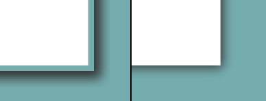
The real answer is CSS margins. Because the canvas app HTML Text component is our browser, the <div> we define is aligned to the left side of the HTML Text component. The box-shadow code is indeed rendering a box, with all 4 edges— however, without some padding in the margins, the left and top edges are cut off.
how to implement
The example shadow I used in the screenshots of this post has a slight offset, a wide blur and a moderate spread. With the original code, I can only see the right and bottom edges:
"<div style='width:"& ico_Sidebar_Menu.Width &"px;height:"& ico_Sidebar_Menu.Height &"px; box-shadow: 0px 4px 20px 10px rgba(51,51,51,1);'></div>"To achieve the desired result, I need to add in a margin parameter to the <div> code. This will push the rendered code out from the top-left corner, creating space for the shadow’s left and top edge to render within the margin. Just like we did with the extra pixels, we need to adjust the margin settings depending on the properties of the CSS box-shadow.
"<div style='width:"& ico_Sidebar_Menu.Width &"px;height:"& ico_Sidebar_Menu.Height &"px; margin: 40px; box-shadow: 0px 4px 20px 10px rgba(51,51,51,1);'></div>"I also needed to make adjustments to the height and width, since now my HTML Text rendered area is 80 pixels wider and 80 pixels taller (because I added a 40px margin to all four edges of the <div>). I did find the need to make the Height property 1 pixel taller to avoid the scrollbar issue.
- Height:
ico_Sidebar_Menu.Height + 81 - Width:
ico_Sidebar_Menu.Width + 80
And last but not least, I needed to adjust the X & Y coordinates of the shadow placement to align the edges of the shadow to account for the new margin buffer.
- X:
ico_Sidebar_Menu.X - 40 - Y:
ico_Sidebar_Menu.Y - 40
The result is a perfectly centered box-shadow around all 4 edges of the sister component. Voilà!
variations
Back to the sidebar menu example: we only need the left edge of the shadow, and don’t want the top, bottom or right edges to accidentally expose an unnecessary shadow. I made the following adjustments to create a left-edge shadow only. This will only add margin to the left edge, and crisply cut the shadow across the other three edges.
- Only add
margin-left: 40px;to the<div>code - Height:
ico_Sidebar_Menu.Height - Width:
ico_Sidebar_Menu.Width + 40 - X: Kept the same as the earlier example,
ico_Sidebar_Menu.X - 40 - Y:
ico_Sidebar_Menu.X
You can make similar adjustments to expose the shadow to a single edge or combination of edges by playing with the Height, Width, X, & Y properties of the HTML Text component in concert with the margin-top, margin-bottom, margin-left and margin-right properties of the CSS code.
conclusion
The moral of this post is: don’t forget your high school CSS code skills, don’t troubleshoot after a long day and don’t blog at 9 o’clock at night. 😂
With every new app that I help build or technique I try to implement, I learn something new. I very much enjoyed breaking this one down to better understand the intersection between the components and to seek out what’s happening to the parts we can’t see when writing the CSS code. Hopefully you came along on this journey with me and understand it better now, too!
If you’re curious about my right-wrong answer:
My initial “solution” to the shadow edge problem was to set the x-offset of the box-shadow code to the width of the HTML Text area component. That sent the shadow to the very right-hand side of the container, leaving only the left-most edge of the box shadow (95%+ of the box shadow was not in the rendered area). I then changed the HTML Text X value to the sister component’s X value minus Self.Width. This just aligned the HTML Text rendered area to the left side of the sister component. While it worked, it’s not an elegant nor repeatable method!

 Joy of Power Apps
Leave a comment